The Psychology of Color: How 25 Paint Choices Affect Your Mood

Chuvic - June 14, 2025
Share

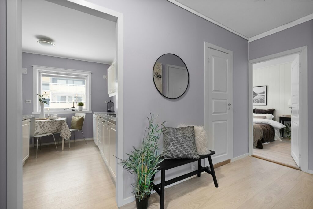
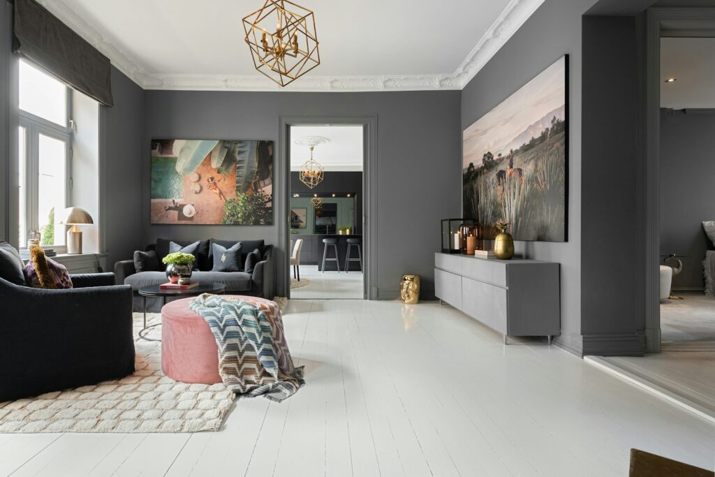
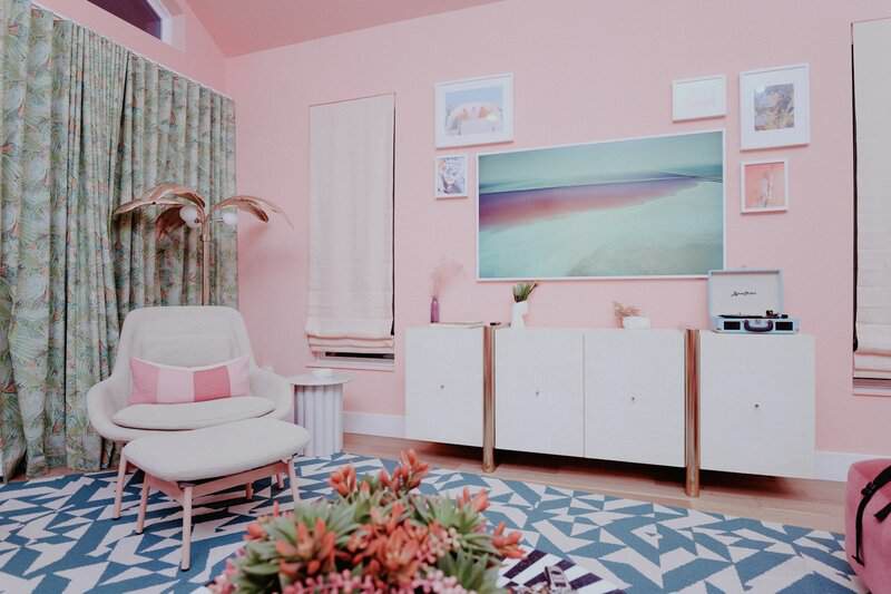
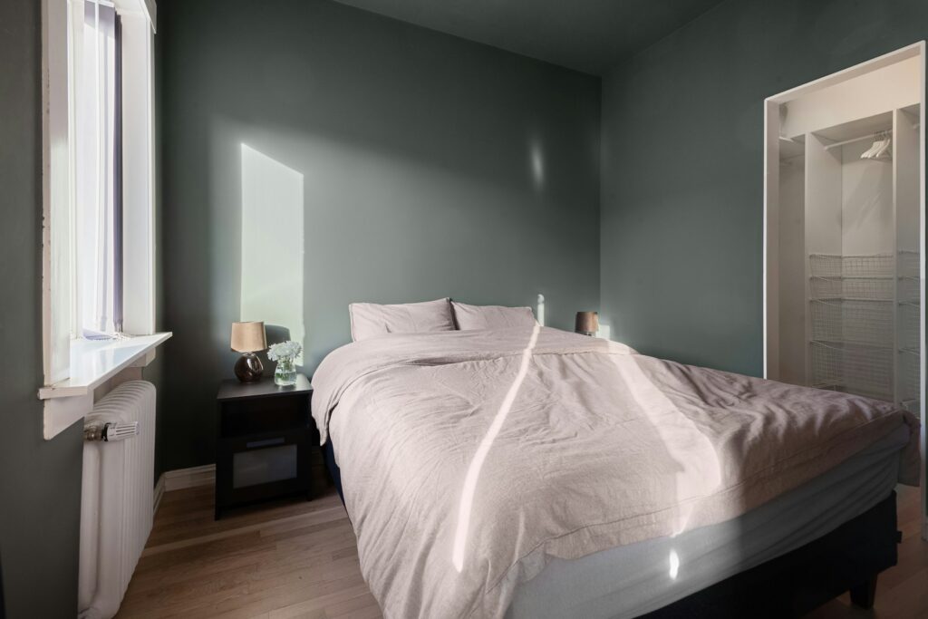
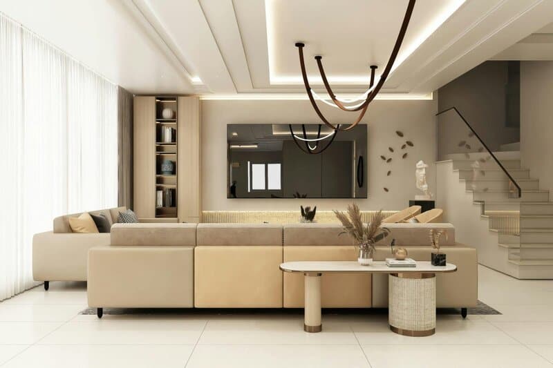
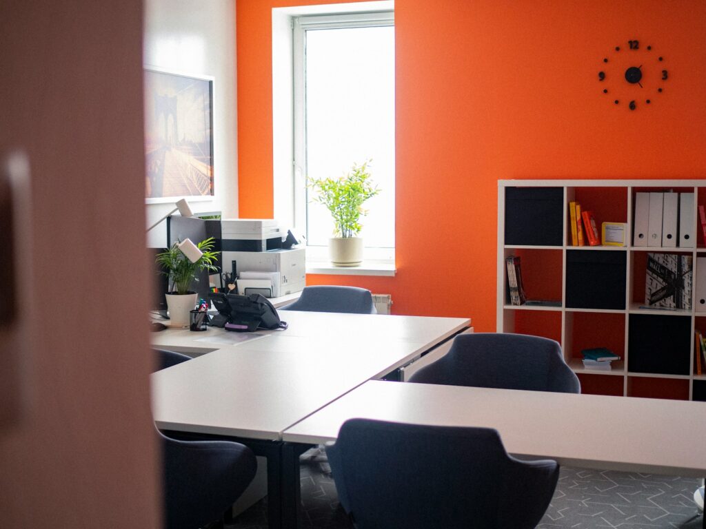
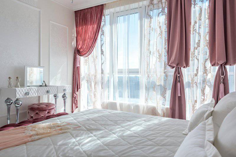
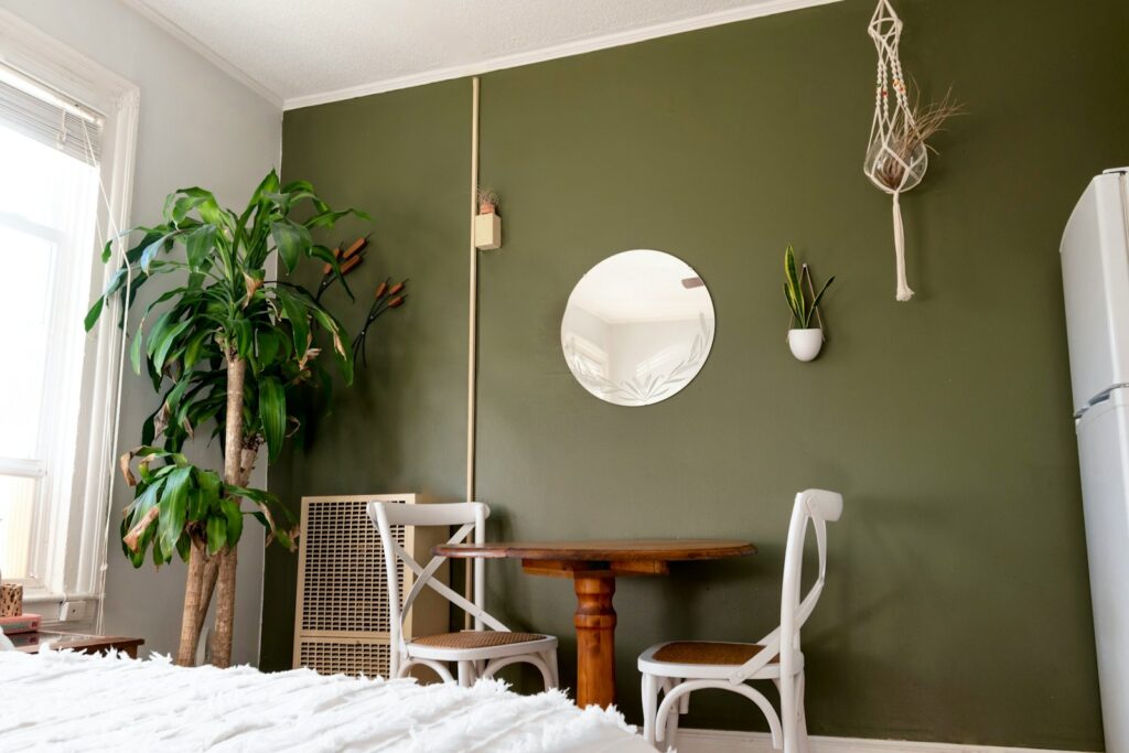
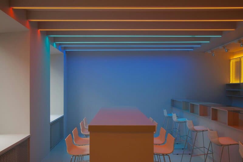
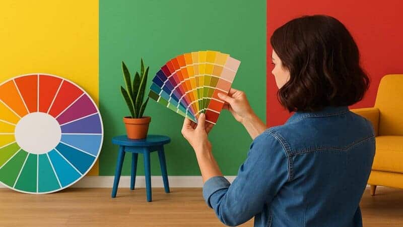
Color has a profound influence on our daily lives, shaping the way we feel, think, and interact within our environments. The shades you choose for your walls are more than just decoration—they can transform moods, boost productivity, and even affect well-being. Understanding the science behind color psychology unlocks powerful insights into how specific hues evoke certain emotions. By exploring how different paint colors impact our mindset, you can create spaces that not only reflect your personality but also foster the atmosphere you desire.

1. Soft Blue

Image
A serene blue bedroom with soft blue walls and calming decor creates a peaceful, inviting retreat. | Image source: Photo by Max Vakhtbovycn on Pexels

Soft blue evokes a powerful sense of tranquility, making it a favorite for spaces meant for relaxation and rest. This gentle hue has been shown in studies to lower heart rate and reduce anxiety, making it ideal for bedrooms or meditation rooms. Researchers from the National Institutes of Health highlight blue’s calming influence on the mind and body. By enveloping your space in soft blue, you create an oasis of serenity—perfect for unwinding after a long day.

2. Sunny Yellow

a room with yellow walls and a bench
Source: Photo by R. raha9170 on Unsplash

Sunny yellow is synonymous with energy and optimism. This vibrant hue brightens any space, making it a popular choice for kitchens and creative work areas where a boost of enthusiasm is welcome. Research, such as findings from the American Psychological Association, links yellow tones to increased feelings of happiness and positivity. A splash of sunny yellow can instantly uplift your mood, sparking creativity and making everyday routines feel a little more joyful.

3. Forest Green

opened wooden slide door
Source: Photo by Mathias Adam on Unsplash

Forest green brings the soothing energy of nature indoors, making it an excellent choice for home offices or living rooms. This deep, earthy hue is associated with tranquility, renewal, and balance. Studies from the Journal of Environmental Psychology show that exposure to green, especially in natural tones, can lower stress and promote mental clarity. Incorporating forest green into your space helps foster a sense of calm, grounding you after busy days.

4. Warm Terracotta

4. Warm Terracotta
A cozy terracotta dining room glows with earthy tones and warm paint, creating an inviting space for gatherings. | Image source: Photo by Sami Abdullah on Pexels

Warm terracotta radiates earthiness and comfort, making it a welcoming choice for dining areas and gathering spaces. This rich, clay-inspired hue evokes feelings of warmth and security, encouraging meaningful connection around the table. According to color psychology research, warm tones like terracotta have a grounding effect, helping people feel more at ease in social settings. Bringing terracotta into your home fosters a cozy, inviting ambiance that draws people together.

5. Pale Lavender

A living room filled with furniture and a mirror
Source: Photo by Alex Tyson on Unsplash

Pale lavender strikes a unique balance between soothing calm and gentle uplift. Frequently used in nurseries and bathrooms, this soft purple shade is known to promote relaxation while subtly brightening the space. Lavender’s connection to tranquility is well documented, with studies indicating its positive effect on reducing stress and encouraging restful sleep. Incorporating pale lavender into your décor creates a nurturing atmosphere, making it ideal for spaces where you seek both comfort and a hint of cheerful energy.

6. Charcoal Gray

A living room filled with furniture and a chandelier
Source: Photo by Lisa Anna on Unsplash

Charcoal gray exudes sophistication and timeless neutrality, making it a staple for modern offices and contemporary living rooms. This deep shade serves as a versatile backdrop that allows other colors and decor elements to shine. It’s well-regarded for its stabilizing effect, helping to ground a space without overwhelming it. Charcoal gray encourages focus and composure, lending a sense of calm authority—a quality especially valued in productive or social settings.

7. Crisp White

7. Crisp White
Sunlight pours into a bright, minimalist room with crisp white walls and sleek, modern furnishings. | Image source: Photo by dada _design on Pexels

Crisp white is celebrated for its ability to create an open, airy atmosphere, instantly making rooms feel larger and more inviting. Frequently chosen for minimalist interiors, white promotes a sense of clarity and simplicity, allowing your mind to feel less cluttered. Its reflective quality enhances natural light, further amplifying the spacious effect. Crisp white is perfect for anyone seeking a fresh start or a clean canvas for creativity and organization in their living spaces.

8. Coral Pink

a living room with pink walls and a white chair
Source: Photo by Ashley Byrd on Unsplash

Coral pink bursts with playful energy, making it a standout choice for creative studios or lively accent walls. This vibrant hue blends the warmth of orange with the sweetness of pink, inspiring enthusiasm and spontaneity. Coral is especially effective in spaces where you want to spark creativity and social interaction. Its energizing presence can lift spirits and encourage bold ideas, ensuring your environment feels both welcoming and invigorating for artistic pursuits or gatherings.

9. Deep Navy

brown wooden table with chairs
Source: Photo by Gaurav Bagdi on Unsplash

Deep navy conveys an air of depth and stability, making it a popular choice for libraries, bedrooms, and other contemplative spaces. This rich color has the ability to promote focus and a sense of security, ideal for areas where concentration is key. Navy’s timeless elegance can also add a touch of sophistication, creating an environment that feels both grounded and serene. It’s especially effective in spaces where you want to encourage reflection and calm thought.

10. Soft Peach

A bed sitting in a bedroom next to a window
Source: Photo by Lisa Anna on Unsplash

Soft peach offers a gentle warmth that immediately welcomes anyone who enters the space. Its subtle blend of pink and orange undertones creates a comforting, friendly atmosphere, making it an excellent choice for entryways and social areas. Peach is known for its ability to foster openness and positive interactions, helping guests feel at ease. This inviting hue softly energizes a room without overwhelming, making gatherings and daily routines feel a bit more cheerful and harmonious.

11. Sage Green

a green room with a bench and a window
Source: Photo by tara sadeghi on Unsplash

Sage green is cherished for its calming and refreshing qualities, making it a top pick for kitchens and bathrooms. This muted, nature-inspired hue introduces a sense of balance and cleanliness, creating an environment that feels both peaceful and revitalizing. Sage’s subtle sophistication effortlessly blends with a variety of styles, enhancing the soothing effect of your daily routines. Whether used on cabinetry or walls, sage green helps refresh the mind and spirit, promoting relaxation in spaces where you start and end your day.

12. Burgundy

a room with a table, chairs, and a mirror
Source: Photo by Alexandr Istomin on Unsplash

Burgundy brings a rich, dramatic flair to interiors, making it an excellent choice for dining rooms or home bars. This deep red hue is associated with luxury, elegance, and a sense of intimacy, encouraging meaningful conversations and memorable gatherings. Burgundy’s boldness adds a layer of sophistication, creating an inviting space that feels both opulent and cozy. If you want your entertaining areas to exude warmth and exclusivity, burgundy is a timeless color that never fails to impress.

13. Soft Mint

A bed sitting in a bedroom next to a window
Source: Photo by Alex Tyson on Unsplash

Soft mint brings a refreshing and revitalizing touch to any room, making it especially popular in bathrooms and nurseries. This gentle green hue evokes feelings of renewal and cleanliness, helping to create a light, airy atmosphere. Mint’s subtle coolness can make spaces feel more open and rejuvenating, perfect for starting the day or soothing little ones. With its uplifting yet calming presence, soft mint is an excellent choice for spaces where comfort and a fresh perspective are key.

14. Warm Beige

14. Warm Beige
A beige living room adorned with plush sofas, soft throws, and neutral accents creates an inviting, cozy retreat. | Image source: Photo by S3T Koncepts on Pexels

Warm beige is a timeless, versatile neutral that instantly creates a cozy and inviting atmosphere. Its soft, earthy undertones work beautifully in living rooms, bedrooms, or any space where comfort is a priority. Beige serves as a warm backdrop that complements a wide range of styles and colors, making decorating effortless. This approachable hue encourages relaxation and togetherness, helping every room feel like home—no matter your personal design preferences.

15. Vibrant Orange

white wooden cube organizer near wooden desk
Source: Photo by Pasha Chusovitin on Unsplash

Vibrant orange is a dynamic, energizing color that instantly enlivens any space. Frequently used in playrooms or exercise areas, orange stimulates enthusiasm and fosters motivation. Its bold presence can help boost activity levels and encourage a playful, upbeat mood. Research shows that exposure to orange can increase feelings of excitement and drive, making it perfect for spaces where you want to inspire movement and creativity. This shade is ideal for anyone seeking an invigorating, action-oriented environment.

16. Dusty Rose

16. Dusty Rose
A dreamy bedroom bathed in soft pink paint features romantic decor and plush dusty rose accents for a cozy retreat. | Image source: Photo by Max Vakhtbovycn on Pexels

Dusty rose radiates a romantic and calming vibe, making it a beloved choice for bedrooms and intimate sitting areas. This muted pink hue blends softness with understated elegance, creating a soothing retreat from the bustle of daily life. Its gentle warmth encourages relaxation and emotional comfort, perfect for unwinding or sharing quiet moments. Dusty rose’s timeless appeal works beautifully with a variety of styles, offering a subtle touch of romance wherever it’s used.

17. Slate Blue

17. Slate Blue
A cozy reading nook nestled against a slate blue wall creates a calm space perfect for unwinding with a good book. | Image source: Photo by Zen Chung on Pexels

Slate blue offers a calming yet sophisticated presence, ideal for home offices or cozy reading nooks. This muted blue-gray shade brings together the tranquility of blue with a touch of refined elegance, supporting focus and clear thinking. Slate blue’s understated richness establishes a peaceful atmosphere without being too bold, making it easy to pair with different decor styles. Its quiet confidence helps foster creativity and concentration, perfect for spaces where both serenity and productivity are desired.

18. Mustard Yellow

18. Mustard Yellow
A cheerful mustard yellow kitchen pops with retro decor, creating a bright and inviting space full of personality. | Image source: Photo by Tyler Tang on Pexels

Mustard yellow stands out with its retro charm and cheerful warmth, making it a favorite for kitchens and creative studios. This rich, golden hue brings a hint of nostalgia while energizing the space, inspiring creativity and lively conversation. Mustard yellow is bold yet inviting, perfect for adding personality without overwhelming the senses. Its unique vibrancy can make daily routines feel brighter and more enjoyable, turning any room into a hub of positive, creative energy.

19. Olive Green

white and brown wooden chair beside green potted plant
Source: Photo by Andrea Davis on Unsplash

Olive green offers a grounding and earthy effect that brings a touch of nature indoors. Frequently chosen for studies or dining rooms, this muted green promotes stability and thoughtful conversation. Olive’s understated richness creates a cozy yet sophisticated atmosphere, ideal for spaces where focus or connection is key. Its natural undertones pair well with wood accents and neutral palettes, making it versatile for various design styles while fostering a warm, welcoming ambiance.

20. Powder Blue

20. Powder Blue
A serene powder blue nursery bathed in natural light, with soft furnishings and airy, light blue painted walls. | Image source: Photo by Marina M on Pexels

Powder blue is celebrated for its light, airy feel that brings a breath of fresh air to any room. This delicate hue is a favorite in nurseries and bathrooms, where a sense of calm and cleanliness is especially valued. Powder blue’s subtle brightness helps make small spaces feel more expansive and open, while its gentle presence soothes the senses. It’s an ideal choice for creating a peaceful retreat that feels both fresh and inviting, perfect for relaxation or quiet moments.

21. Chocolate Brown

brown leather 3-seat sofa
Source: Photo by Leilani Angel on Unsplash

Chocolate brown exudes security and comfort, making it a go-to choice for living rooms and cozy dens. This rich, earthy color wraps a space in warmth, inviting relaxation and a sense of belonging. Brown’s grounding qualities help create an environment where people feel safe and at ease, perfect for unwinding or gathering with family. Its versatility also allows it to pair beautifully with both vibrant accents and softer neutrals, enhancing the welcoming ambiance of any home.

22. Classic Red

red plastic chair beside black table
Source: Photo by Christine Donaldson on Unsplash

Classic red bursts with stimulating, passionate energy, making it a dramatic choice for dining rooms or striking accent walls. This bold hue heightens excitement and encourages lively conversation, perfect for spaces meant for entertaining or gathering. Red’s intensity is associated with warmth, appetite, and even increased heart rate, creating an environment where everything feels a bit more vibrant. Whether used in small doses or as a statement, classic red injects undeniable life and dynamic presence into any room.

23. Blush Pink

white bear plush toy on white and pink floral bed
Source: Photo by hung dinh on Unsplash

Blush pink radiates a subtle warmth and nurturing ambiance, making it a cherished choice for bedrooms and nurseries. This soft, delicate hue evokes feelings of tenderness and comfort, helping to foster a soothing retreat for relaxation or rest. Blush’s gentle glow pairs effortlessly with both modern and classic décor, adding a touch of elegance without overwhelming the senses. Its comforting presence encourages calm, making any space feel safe, cherished, and thoughtfully designed for well-being.

24. Teal

24. Teal
A stylish bathroom features a bold teal accent wall, complemented by creative decor and modern fixtures for a fresh look. | Image source: Photo by Max Vakhtbovycn on Pexels

Teal artfully balances calm and energy, making it a standout option for bathrooms or creative spaces. This vibrant blue-green shade combines the tranquility of blue with the invigorating qualities of green, resulting in a hue that soothes yet stimulates. Teal encourages both relaxation and inspiration, helping you recharge or spark new ideas. Whether used as an accent or a dominant wall color, teal delivers a fresh, modern feel that enlivens any environment without overwhelming the senses.

25. Black

25. Black
A striking black accent wall sets the stage for elegant decor, creating a dramatic and sophisticated living space. | Image source: Photo by Curtis Adams on Pexels

Black brings a sense of drama, elegance, and grounding to interior spaces, making it a powerful tool for accent walls or statement details. Used in small doses, black can add depth and sophistication without making a room feel closed in. Its bold presence helps anchor lighter palettes and highlight architectural features. When incorporated thoughtfully, black elevates the overall design, introducing a touch of modernity and balance while providing a striking contrast that draws the eye.

Conclusion

Conclusion
A vibrant paint color palette rests on a table, inspiring a room transformation influenced by color psychology principles. | Image source: Photo by MART PRODUCTION on Pexels

The colors you choose for your walls have the power to transform your mood and shape the energy of every space. From calming blues and energizing yellows to grounding earth tones and dramatic accents, each hue brings its own psychological influence. Thoughtfully selecting paint colors allows you to curate environments that support your well-being and reflect your personality.
Consider what emotions you want to evoke in each room, and let color psychology guide your decisions. A mindful palette can help you create a home that truly feels like your sanctuary.

.article-content-img img { width: 100% }
Advertisement