Restaurants’ Color Psychology Tricks: 20 Colors Making You Order Seconds

Chuvic - May 21, 2025
Share

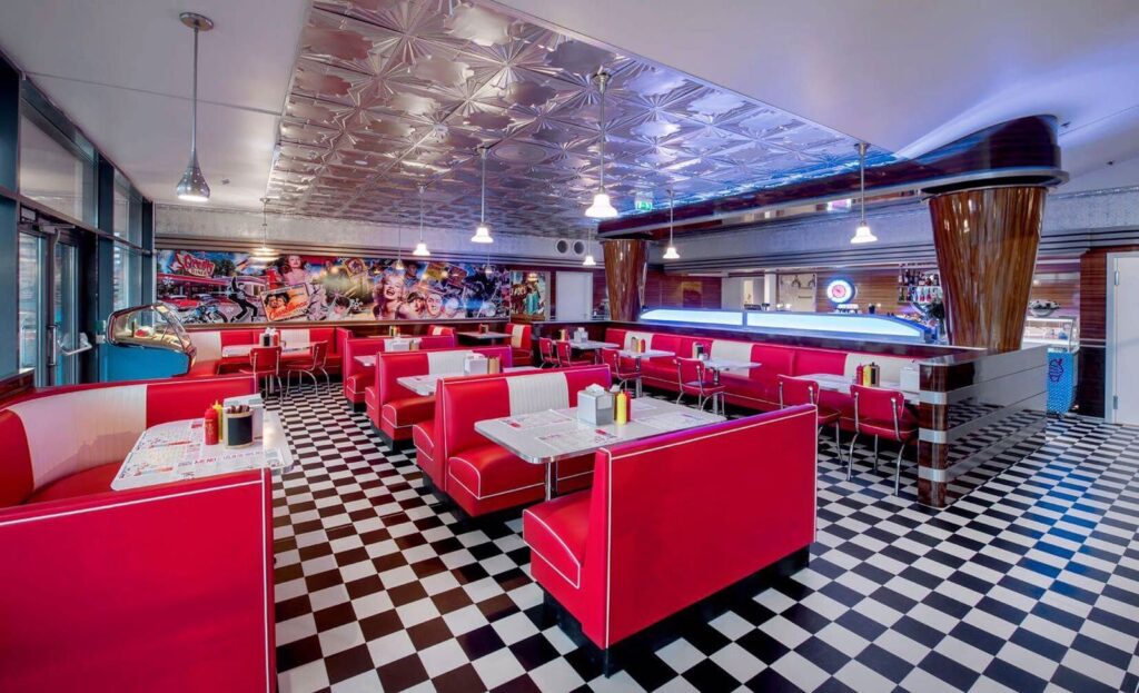
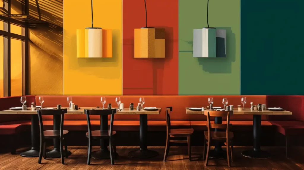
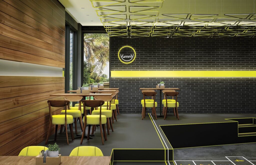
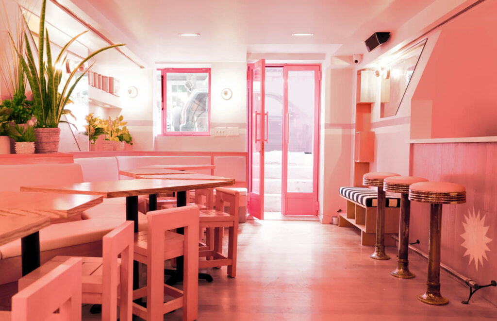
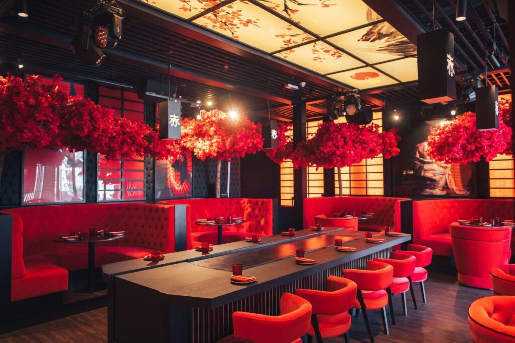
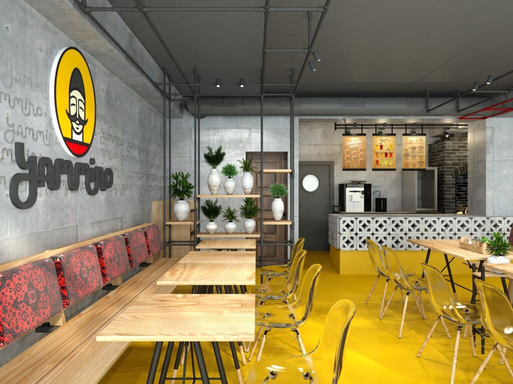
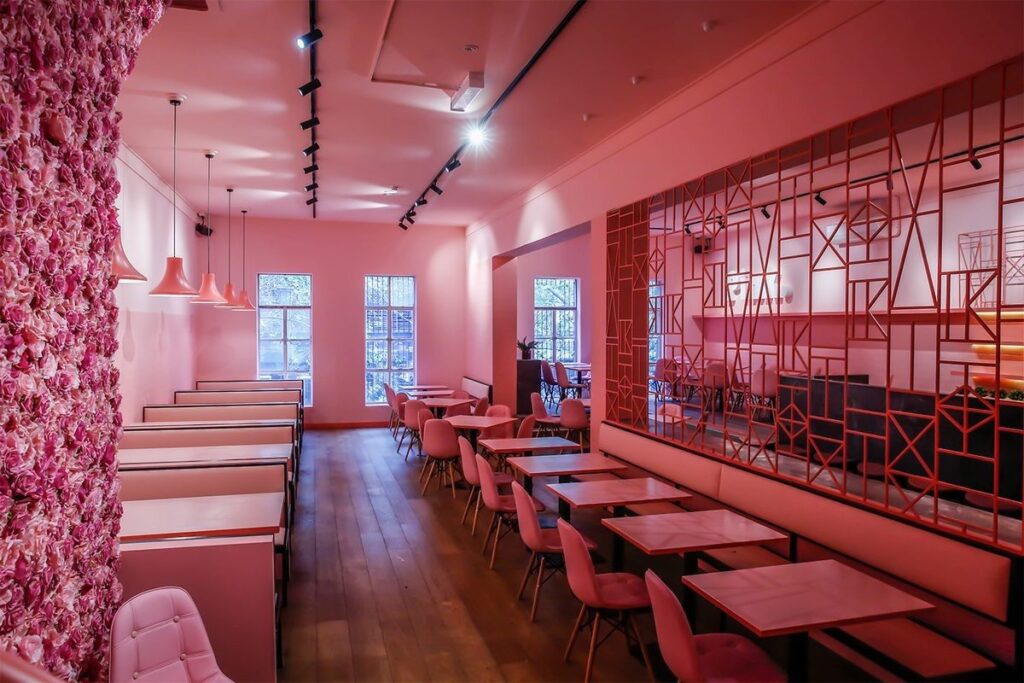
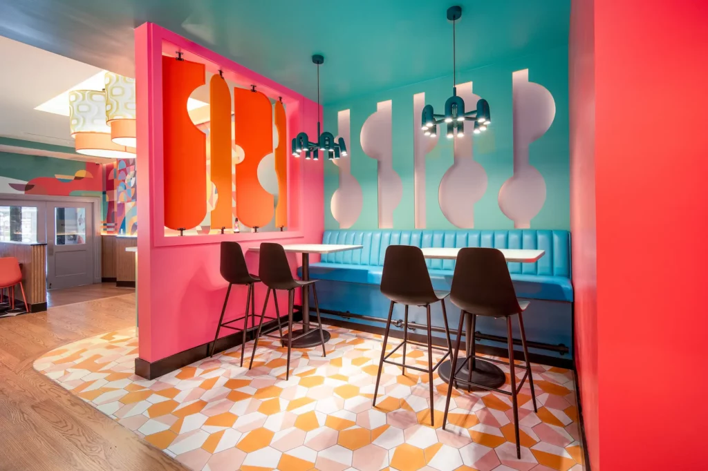
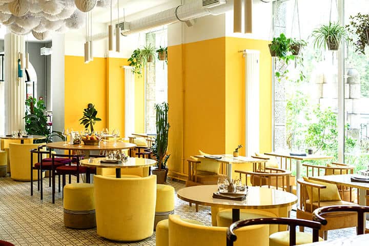
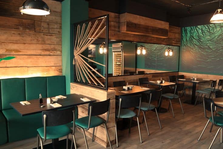
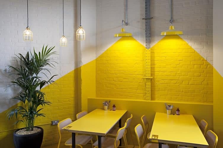
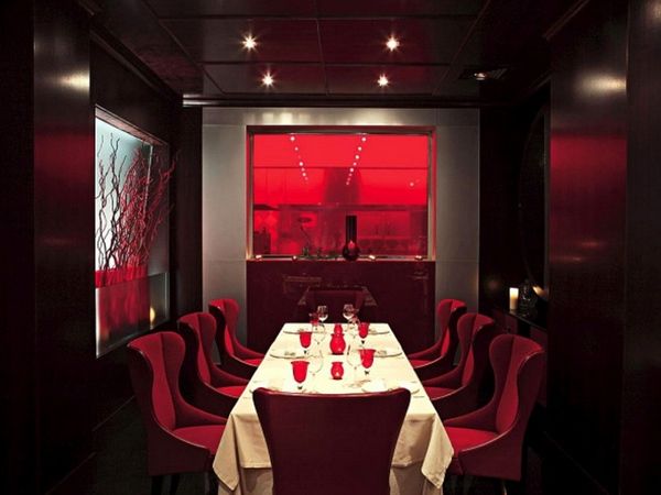
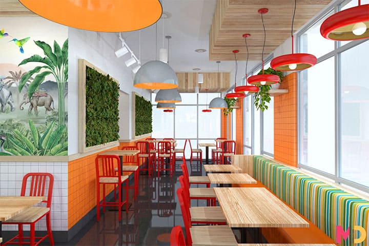
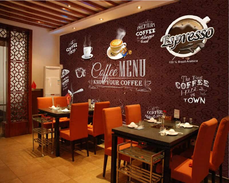
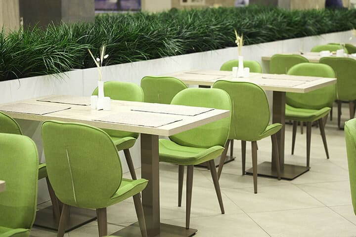
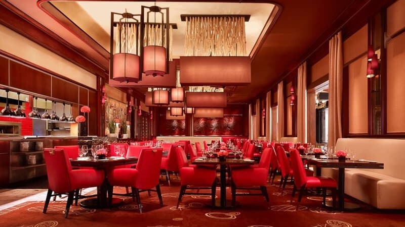
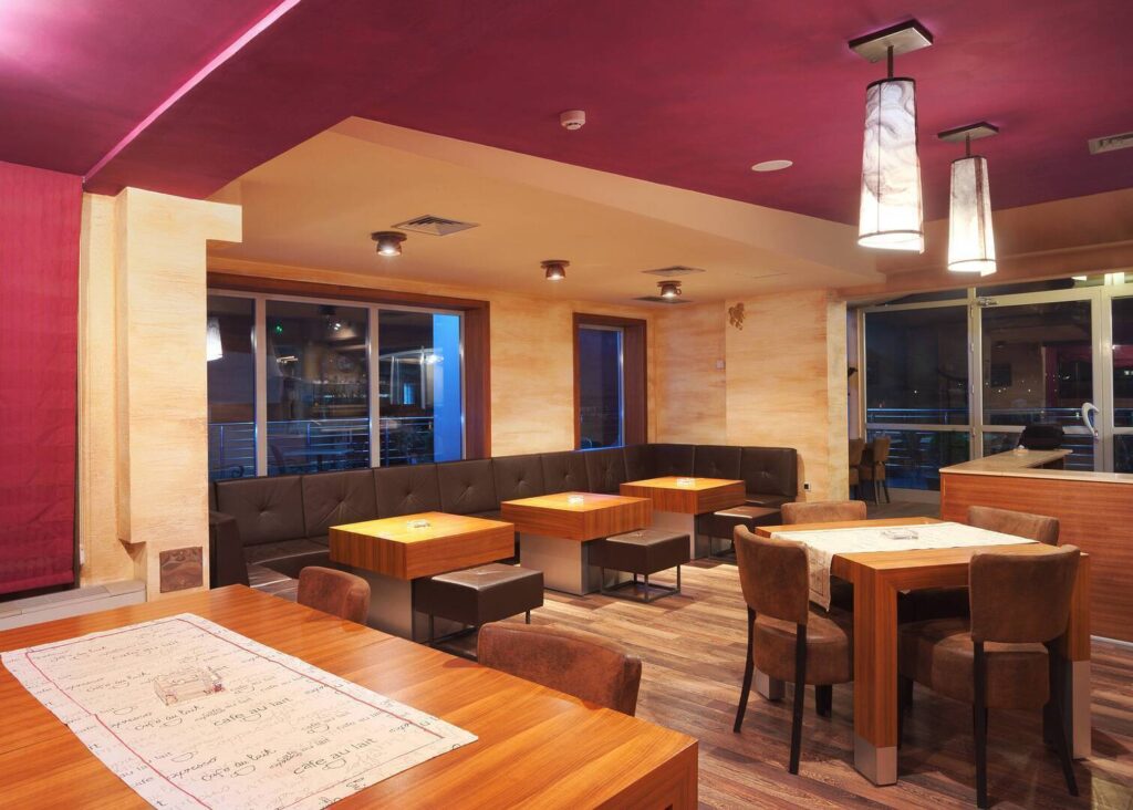
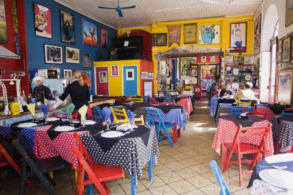
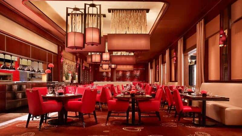
Colors do more than catch your eye. They trick your brain into feeling hunger, even when your stomach might be full. Restaurants know this secret and use specific colors to boost your appetite and make food look more delicious. Next time you walk into a restaurant, notice how these colors surround you, subtly encouraging you to order more than you planned.

Red

09aec8c9c6e540663efefc60638ad3b9
Source: pinterest.com

Red grabs your attention immediately and speeds up your heart rate, which makes you feel hungrier. Fast-food giants like McDonald’s use this color everywhere because it creates urgency in customers. You probably make quicker decisions when surrounded by red walls or signs. This bright shade connects to hearty, filling foods like burgers or pizza in our minds. Next time you see red in a restaurant, watch how it affects your food choices.

Orange

Colorscheme 2307270nvrkm
Source: ckitchen.com

Orange fills spaces with warmth and excitement that puts you in the mood to eat. Restaurants add orange touches to their logos or walls when they want you to feel welcome and order impulsively. The color reminds us of citrus fruits and spices. You might notice this shade in taco shops or places serving zesty, bold foods. Orange creates a friendly vibe that makes you want to stay longer and order more food.

Yellow

1b977cecaa33cf49befdb9010bfc9aca
Source: pinterest.com

Yellow triggers happiness in your brain, and happy people eat more. Breakfast spots and casual restaurants use yellow to create sunny, cheerful spaces where food looks more appealing. This bright color pairs perfectly with comfort foods like pancakes, eggs, and mac and cheese. Your brain connects yellow with simple pleasures and satisfaction. Many fast-food chains incorporate yellow because it makes their food look tastier and more satisfying.

Warm Pink

Pietro Nolita 1
Source: okchicas.com

Warm pink surrounds you with comfort and subtle encouragement to treat yourself. Dessert shops and cafes love this color because it makes sweet treats look even more tempting. The gentle tone helps you relax and slow down. People tend to linger longer in pink spaces, ordering more as they enjoy the pleasant atmosphere. This soft shade works especially well with cupcakes, ice cream, and other indulgent desserts.

Tomato Red

Japanese Sample Design
Source: vortexrestaurantequipment.ca

Tomato red mimics ripe produce and triggers immediate cravings for fresh, vibrant flavors. Italian restaurants use this shade extensively because it connects to marinara sauce and fresh ingredients. Your brain quickly associates this color with pizza, pasta, and other satisfying dishes. The lively hue creates excitement about food before it even arrives at your table. Many menus highlight special dishes with this color to draw your attention.

Golden Yellow

B330e18cfab8450b9edbff72141c662d
Source: pinterest.com

Golden yellow reminds us of crispy, fried foods that deliver immediate satisfaction. Many restaurants use this shade on menus to highlight comfort foods like onion rings or fried chicken. The warm, rich tone sparks cravings for crunchy textures and indulgent flavors. Fast-food places and diners often incorporate golden yellow in their color schemes. Your brain instantly connects this shade with satisfying, filling meals.

Peach

93668bf1a03698064355b04bd02eb3f1
Source: pinterest.com

Peach creates an inviting atmosphere that gently stimulates your appetite without overwhelming you. Brunch spots and casual cafes use this color to make guests feel relaxed and open to trying new foods. The soft warmth reminds people of summer fruits and light meals. You might notice this color in places serving smoothies, fruit bowls, or lighter fare. Peach works well for restaurants wanting to create a friendly, approachable vibe.

Coral

Peachy Keen 6
Source: 6sqft.com

Coral combines pink and orange to create energy that encourages lighter, flavorful eating. Seafood restaurants and tropical-themed places often use this vibrant color in their decor. The bright shade keeps diners engaged and interested in their food throughout the meal. Many coastal restaurants incorporate coral to evoke fresh catches and beachy vibes. This color pairs perfectly with dishes like ceviche or tropical fruit desserts.

Butter Yellow

Restaurant Color Yellow2
Source: wasserstrom.com

Butter yellow reminds us of rich, creamy foods that satisfy deep cravings. Bakeries and fine dining establishments often use this shade to highlight decadent options on their menus. The soft color creates immediate associations with croissants, pastries, and buttery sauces. Many people feel comforted by this shade and order more indulgent items. The warm tone makes food appear more satisfying before you even taste it.

Caramel Brown

Home Interior With Ethnic Boho Decoration Living Room In Brown Warm Color
Source: homedecorbliss.com

Caramel brown surrounds you with warmth that evokes sweet, sticky treats. Coffee shops and dessert bars use this rich color to create cozy spaces where people want to indulge. The earthy tone reminds us of toffee, chocolate, and other satisfying sweets. Many people stay longer in spaces with caramel-colored accents. This shade particularly enhances the appeal of dessert menus and sweet breakfast items.

Olive Green

F7b9d71b776e82e3790a580d057b4cba
Source: pinterest.com

Olive green suggests freshness and appeals to health-conscious eaters looking for wholesome options. Farm-to-table restaurants use this earthy shade to emphasize their connection to natural ingredients. The color creates immediate associations with salads, vegetables, and artisanal breads. People tend to feel better about their food choices in olive-green spaces. Many organic cafes incorporate this shade to signal their commitment to fresh, quality ingredients.

Saffron Yellow

2c8faf3198a468dbea157964211008da
Source: pinterest.com

Saffron yellow evokes exotic flavors and the warmth of aromatic spices. Ethnic restaurants, particularly those serving Indian or Spanish cuisine, use this vibrant color to create an adventurous atmosphere. The rich tone reminds diners of curries, paella, and other boldly seasoned dishes. People feel more open to trying new flavors in spaces with saffron accents. Many menus highlight signature spicy dishes with this eye-catching shade.

Cherry Red

9881fe05e8fa03fe39bfecbff63db327
Source: pinterest.com

Cherry red captures the juicy appeal of fresh fruits and tangy sauces. Diners and casual restaurants use this bright color to increase excitement about their food offerings. The vivid shade instantly connects to cherry pie, barbecue ribs, and other flavorful favorites. Many people experience stronger cravings when surrounded by cherry red accents. The color works particularly well for restaurants specializing in bold, tangy flavors.

Tangerine

Orange Tones And Tropical Wallpaper Restaurant Design
Source: mindfuldesignconsulting.com

Tangerine fills spaces with zesty energy that makes every bite seem more exciting. Fusion restaurants and juice bars favor this bright shade because it makes food look fresher and more vibrant. The citrusy color naturally pairs with refreshing dishes like citrus-glazed fish or fruity desserts. People feel more energized in tangerine-colored environments. Many tropical-themed restaurants use this shade to create an upbeat, vacation-like atmosphere.

Warm Beige

Buffet Restaurant Interior Design
Source: paintersinc.net

Warm beige creates a homey backdrop that makes comfort food even more appealing. Family-style restaurants use this neutral tone to help diners feel relaxed and settled. The soft color forms a perfect background for mashed potatoes, casseroles, and other heartwarming classics. People tend to order larger portions in beige spaces. Many traditional eateries incorporate this shade to signal reliability and familiar flavors.

Mustard Yellow

9a6a10e4775f7843245ac926f5a9d20a
Source: pinterest.com

Mustard yellow adds boldness that makes savory foods look more tempting. Delis and gastropubs incorporate this spicy shade to highlight sandwiches and other handheld foods. The rich color naturally connects to condiments and sharp cheeses that add flavor to simple dishes. People notice menu items featured in mustard yellow more quickly than others. Many trendy restaurants use this shade to signal their contemporary take on classic comfort foods.

Cinnamon Brown

Cafe With Dark Brown Themed Interior Ebijd745fpqkz52g
Source: wallpapers.com

Cinnamon brown fills restaurants with warmth that makes aromatic foods seem more inviting. Rustic eateries and bakeries use this spicy shade to create cozy, appetizing environments. The rich color instantly connects to spiced desserts, roasted meats, and other flavorful dishes. People tend to linger over their meals in cinnamon-toned spaces. Many seasonal menus highlight fall and winter specials with this comforting color.

Apple Green

Max Titov E9ttl 2 4lc Unsplash 1
Source: wasserstrom.com

Apple green signals freshness that appeals to diners seeking lighter, healthier options. Juice bars and vegan cafes use this bright shade to emphasize the vitality of their offerings. The crisp color creates immediate connections to salads, green smoothies, and other nutrient-rich foods. People often feel virtuous about their choices in apple-green environments. Many health-focused restaurants incorporate this shade to signal their fresh, plant-based focus.

Brick Red

Rd Allegro 1024x576
Source: gajahbumi.com

Brick red grounds spaces with earthy warmth that makes hearty foods more appealing. Steakhouses and farmhouse-style restaurants use this robust shade to create substantial, satisfying atmospheres. The deep color naturally pairs with grilled meats, stews, and other filling dishes. People tend to order larger portions and heartier options in brick-red environments. Many rustic eateries incorporate this shade to signal tradition and quality.

Cream

Dreamstime Xl 22019980
Source: armstrongcalbuilders.com

Cream surrounds diners with subtle richness that encourages indulgence. Upscale restaurants and patisseries use this soft shade to highlight luxurious textures in their food. The gentle color forms perfect associations with creamy soups, custards, and other smooth, satisfying dishes. People often choose more decadent options when cream tones dominate the space. Many fine dining establishments incorporate this shade to signal sophistication and quality.

The Colorful Science Behind Your Cravings

Gettyimages 1485227551 449935aa5c6c4ce6a9e22f15a1c6214f
Source: liveabout.com

Colors influence our eating habits more than we realize. Warm shades like red and orange trigger physical responses that increase hunger, while earthy tones create comfort that encourages indulgence. Restaurants carefully choose their color schemes based on the dining experience they want to create and the foods they serve. Next time you find yourself ordering more than planned, look around. The colors surrounding you might be the real reason you suddenly wanted dessert after claiming you were full.

Advertisement